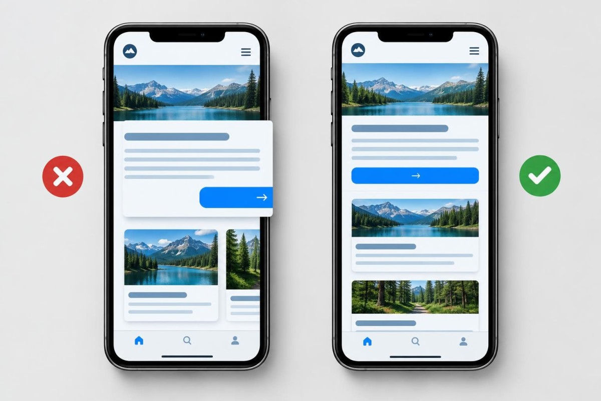
A business website can look perfectly normal on a desktop and still be frustrating on a phone. A button may disappear off the right edge, the menu may cover the page, or a contact form may be impossible to finish. Those are mobile layout problems—not automatically a reason to buy a new website.
Start by identifying which customer action is blocked, on which page, and under which conditions. Then test whether the problem comes from one piece of content, a shared template, or a recent change. This checklist gives a small-business owner a useful first diagnosis and a clear way to request the right repair.
First, separate a broken layout from a slow website
“The site is bad on my phone” can describe two different problems. If the page takes too long to appear or respond, investigate loading and performance. If it loads but elements are cut off, overlapping, unreadable or impossible to tap, investigate responsive layout and interaction. Both can happen at once, but they need different tests.
Our earlier guide on diagnosing a slow WordPress website on mobile addresses performance. This guide is about what appears on the screen and whether a customer can use it. Avoid installing a speed plugin to fix a button that is simply positioned outside the visible area.
Capture the failure before changing anything
Open the affected page on an actual phone. Note the page URL, phone model, browser, orientation and approximate time. Take a screenshot that includes the problem, but remove private customer details. If possible, record a short screen capture showing the taps or scrolling that produce it. Try a second browser or device if one is readily available.
Next, answer three questions: Does the same failure occur on every page or only one? Does it happen at all phone widths or only a particular size? Did it begin after a content edit, theme change, plugin update or embedded widget change? These answers help distinguish a sitewide template problem from a single oversized element.
For a controlled comparison, Chrome’s Device Mode guide explains how a developer can simulate different viewport widths and orientations. Simulation is useful for locating a breakpoint problem, but it is not a replacement for checking a real phone and its touch behavior.
Five common mobile layout symptoms and what to inspect
1. The page scrolls sideways or content is cut off
A wide table, image, embedded calendar, fixed-width column or long unbroken string may be wider than the phone screen. Look for the first section where horizontal scrolling begins. If one widget causes it, repairing that widget’s width or responsive behavior is usually more targeted than changing the whole theme.
Do not simply hide horizontal overflow across the entire page as a first fix. That can conceal a button or important content rather than make it usable. MDN’s CSS overflow documentation explains how clipping and scrolling behave; the goal is to make the content fit or provide intentional scrolling where appropriate.
2. The mobile menu opens but blocks navigation
Check whether the menu can be opened, scrolled and closed. Can a customer reach every important service page? Does the menu overlap a sticky header or remain stuck over the page? If the desktop menu works, the problem may involve mobile-specific styling, stacking order or a script conflict. Record the exact tap sequence rather than reporting only that “the menu is broken.”
3. A contact button or form cannot be used
Test the actual inquiry path. A button may look visible but be covered by an invisible overlay; a form field may extend beyond the screen; a keyboard may obscure the submit button. Confirm that the form can be completed, submitted and acknowledged. A successful visual repair is not enough if the inquiry still does not reach the business.
Where a form is involved, use a clearly marked test submission and verify the result through the site’s normal intake process. This is a functionality test, not evidence of a new customer lead.
4. Text, cards or images overlap at one screen width
Fixed heights, overly large headings, unusual font loading or rigid multi-column layouts can leave too little room for content. Test a narrow phone and a slightly wider one, in both portrait and landscape where relevant. The web.dev responsive design introduction shows why flexible layouts, fluid media and viewport settings matter. The practical question is whether the design adapts to the available space without hiding meaning.
5. The simulator looks fine, but the real phone does not
Browser differences, cached assets, mobile browser controls, touch targets, font rendering and third-party embeds can produce differences. Check the page in a private window, then compare the real device with the simulated viewport. Do not clear every cache or disable plugins indiscriminately. Change one plausible cause at a time and retest the same failure.
Run a 15-minute customer-path check
Instead of inspecting dozens of decorative details, follow the path a prospective customer is most likely to take. Use this short sequence and mark each step as working, impaired or blocked:
- Find the service: Open the homepage and reach one important service page using the mobile menu.
- Understand the offer: Read the service description without zooming, sideways scrolling or losing text behind a floating element.
- Find the next action: Locate the contact or inquiry button and confirm it is not covered by a banner or sticky bar.
- Complete the action: Fill out the form or follow the appropriate contact path on the phone, including when the on-screen keyboard is open.
- Confirm the outcome: Check the confirmation message and, for a test form, the actual notification or saved submission.
If the homepage looks polished but step four fails, the repair priority should be the customer action, not a cosmetic redesign. If one lower-priority gallery crops slightly while the inquiry path works, document it without giving it the same urgency.
Decide whether to repair one page, a shared template or the design system
Use the smallest safe scope that fixes the underlying cause. If only a single embedded calendar overflows, start with that embed. If every service page has a clipped heading, inspect the shared page template or global style. If menus, forms, spacing and typography fail across many templates, a more deliberate responsive design review may be justified.
A recent plugin or theme change can be a useful clue, but timing alone does not prove causation. Keep a backup or rollback plan before editing live layout files, especially if the site accepts orders or customer inquiries. Test on staging when the change has meaningful risk. Our WordPress development and website support work is relevant when the problem requires tracing theme, plugin or custom-code behavior rather than swapping design settings at random.
Do not assume that every mobile issue calls for a full rebuild. The distinction between a contained repair and broader redesign is also covered in our website redesign versus refresh guide.
Send a repair request that gives someone a fair chance to reproduce it
A useful request identifies the affected URL, expected behavior, actual behavior, device and browser, steps to reproduce, screenshot and business impact. For example, a hypothetical report might say: “On a narrow phone in portrait view, the contact button on the service page is clipped at the right edge. I can reproduce it after opening the page directly. The desktop button works.” That is more actionable than “mobile is broken.”
Include when the issue was first noticed and whether it is intermittent. Avoid emailing customer information, passwords or administrator credentials with screenshots. Our WordPress problem-reporting checklist provides a fuller handoff structure.
Verify the repair where customers will use it
After a fix, repeat the original steps on the same device and test at least one other narrow width. Recheck the menu, the repaired section and the complete inquiry path. If the change touched a shared template, sample a few other page types too. Record what changed, what was tested and whether the original problem is gone. A passing screenshot alone does not prove a form or navigation path works.
When a mobile layout problem is blocking customers and you want help defining a practical repair scope, request a Discovery Call with Grassroots Consulting. Start with the exact symptom and the affected customer action; that makes the first conversation more useful.
Built in collaboration with ChatGPT.