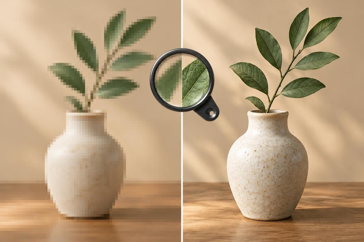
A photo can look perfectly sharp in your camera roll and fuzzy once it appears on your WordPress website. Before buying another image plugin or replacing every photograph, identify which version of the image the visitor actually sees. Blurriness can come from a small source file, an undersized WordPress thumbnail, a layout that stretches the image, or an optimization setting that removes too much detail. Those problems need different fixes.
This guide focuses on image clarity, not general website speed or a broken mobile layout. The goal is to correct the smallest part of the image workflow that is responsible, while keeping the page reasonably fast.
Start with one blurry image, not the entire media library
Choose one image that looks wrong on a public page. Open the same page on a phone and a desktop, then compare the picture with the original file if you have it. Record the page URL, the image’s location (hero, gallery, staff photo or product card), which devices look blurry, and whether the problem began after a redesign or update. A screenshot helps, but keep the original image file for comparison.
Use this four-check sequence. It is a diagnostic order, not a promise that every WordPress site uses the same theme, image service or optimization plugin.
Check 1: Is the original photograph sharp enough?
Open the original file outside WordPress at roughly the size people see it on the page. If it already looks soft, the website cannot recover detail that was never captured. A tiny image downloaded from a message or social media may have been compressed before it reached you. Increasing its pixel dimensions afterward usually enlarges the blur rather than restoring the missing detail.
Look at pixel dimensions, not just file size. For example, a 600-pixel-wide photo stretched across a 1,200-pixel-wide banner is likely to look soft. On a high-density screen, a displayed 600-pixel-wide area may benefit from an image around 1,200 physical pixels wide, subject to the design and browser’s image selection. This is a working illustration, not a universal upload rule.
If the source itself is weak, find the highest-quality owned original, export a correctly sized version, and compare it before uploading. Do not automatically upload the largest possible file: an enormous photograph may create a separate loading problem.
Check 2: Is WordPress serving a thumbnail where a large image belongs?
WordPress commonly generates several image sizes when a file is uploaded. Your theme or page builder can choose a thumbnail, medium, large or custom crop. The original may be sharp in Media Library while the page displays a smaller generated copy stretched beyond its intended dimensions. WordPress documents its native srcset and sizes system, which helps browsers select an appropriate image candidate.
In the page editor, select the image and inspect the chosen size. If a full-width section uses a small thumbnail, switch to an appropriately sized version and preview the result. For a gallery or card grid, test the image in its actual display slot rather than forcing every image to full resolution. Some themes generate special image sizes, so the exact controls vary.
When the selected image size looks correct but the front end is still fuzzy, ask the developer to inspect the actual image URL and responsive srcset/sizes markup. An incorrect size hint or a missing generated size can cause the browser to choose a file that is too small. WordPress explains the underlying behavior in its responsive images documentation.
Check 3: Is the design stretching or cropping the image?
Sometimes the file is fine and the layout is the problem. A square team portrait placed in a very wide hero, a logo expanded far beyond its native width, or a background image forced to cover a large area can appear blurred or heavily cropped. A background image may be rendered differently from a normal inline image, so changing the Media Library setting alone may not fix it.
Compare the displayed width with the actual delivered image dimensions. If a 400-pixel file is being drawn at 1,000 pixels, investigate the image-size selection and layout settings. If the problem occurs only at one screen width, inspect that breakpoint’s image or background configuration. Do not solve a bad crop by stretching the file further; adjust the aspect ratio, focal point or image choice.
This is different from buttons, menus or columns breaking on phones. For broader responsive layout problems, see our mobile website layout troubleshooting checklist.
Check 4: Is an image optimizer, CDN or cached copy reducing quality?
Image compression is useful, but aggressive settings can make fine detail, small lettering inside a legitimate photograph, or gradients look muddy. A CDN may also deliver a transformed image size, while caching can make an older version remain visible after you upload a replacement.
Compare the original, the WordPress Media Library version, and the actual file delivered on the public page. Check whether the URL or response indicates a transformed size or format. If a plugin or CDN is involved, review its image-quality and resizing settings rather than disabling all optimization sitewide. Purge only the relevant caches after a controlled change, and test again in a private browser window.
Keep a backup and a way to reverse the change. If images across the entire site suddenly degraded after a plugin, theme or hosting change, investigate the shared delivery setting before replacing individual files. Our backup recovery readiness guide explains why a usable restore path matters before broad changes.
A quick symptom-to-cause decision table
| What you observe | First thing to inspect | Safer first action |
|---|---|---|
| Original file is blurry everywhere | Source dimensions and compression history | Locate a better original before editing the website |
| Media Library image is sharp, page image is fuzzy | Selected image size and delivered URL | Test an appropriately sized image variant |
| Only the banner or one device looks wrong | Layout width, crop and responsive breakpoint | Adjust the display slot or art direction |
| Many images became soft after a change | Optimizer, CDN transformation and cache | Compare a controlled before/after sample |
For a simple test, make a temporary copy of one affected page in a staging environment. Change one factor at a time, capture the same viewport before and after, and compare clarity as well as loading behavior. If the test fails, restore the previous setting. That is more reliable than installing multiple image tools and guessing which one helped.
Keep clarity and performance in balance
The sharpest available source is not always the best file to deliver to every visitor. Modern responsive images let a browser select among versions based on viewport and display density. The web.dev responsive image guide explains how srcset and sizes work together. WordPress also provides guidance on image size and quality.
After improving sharpness, check whether the page became noticeably heavier. A clear product photo that takes too long to appear is not a complete fix. Review the relevant page in PageSpeed Insights if you need a performance baseline, but remember that a single lab score is not a direct measurement of every visitor’s experience.
What to send your website support provider
A useful support request includes the public page URL, which image is affected, one screenshot showing the blur, the original file or its dimensions, the devices tested, and whether the issue started after a known change. Ask for the delivered image URL and its dimensions to be compared with the display slot. That gives a developer a reproducible question rather than a vague instruction to “make all images sharper.”
If the cause involves your theme, builder or image-delivery settings, our WordPress development and support services can help isolate it without turning a one-image problem into an unnecessary sitewide overhaul.
Need a second set of eyes? Request a discovery conversation and share one affected page so the issue can be assessed in context.
Built in collaboration with ChatGPT.